
Date released 2000 | Foundry Hoefler & Co. | |
 | ||
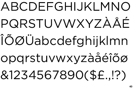
Link typography.com/fonts/gotham/overview Variations Gotham rounded, Gotham condensed, Gotham X-narrow, Gotham bold, Gotham narrow | ||
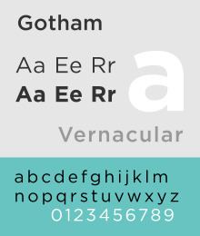
Gotham is a family of widely used geometric sans-serif digital typefaces designed by American type designer Tobias Frere-Jones in 2000. Gotham's letterforms are inspired by a form of architectural signage that achieved popularity in the mid-twentieth century, and are especially popular throughout New York City. Gotham has a relatively broad design with a reasonably high x-height and wide apertures.
Contents
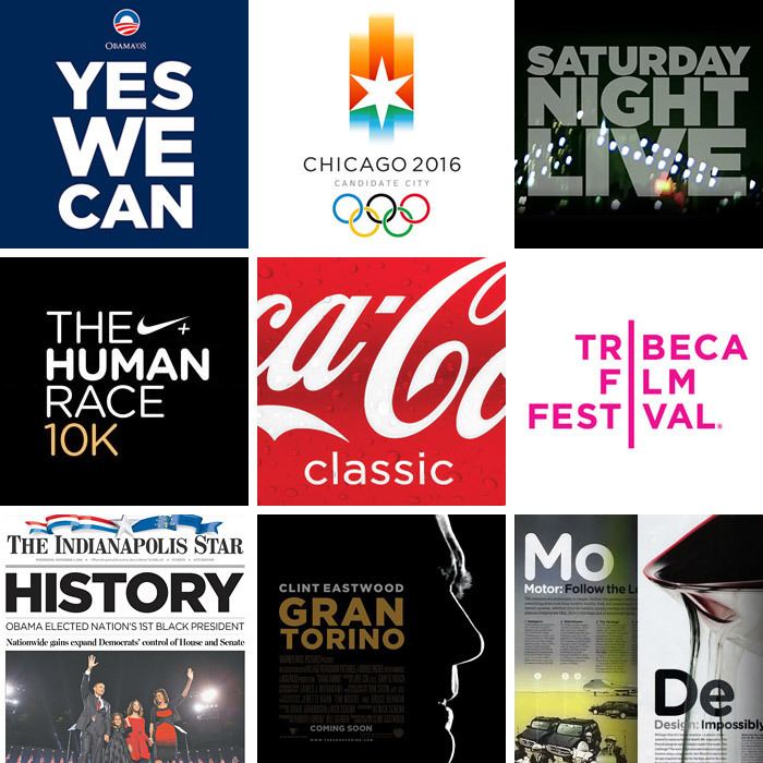
Since creation, Gotham has been highly visible due to its appearance in many notable places, including a large amount of campaign material created for Barack Obama's 2008 presidential campaign, and the 2016 federal election campaign of the Australian Labor Party. The font has also been used as the cornerstone of the One World Trade Center, the tower built on the site of the former World Trade Center in New York. It is also the current font to be used in title cards for film trailers in the US.
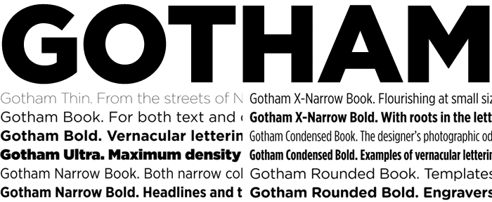
Developed for professional use, Gotham is an extremely large family, featuring four widths, eight weights, and separate designs for screen display.
Creation and style
The Gotham typeface was initially commissioned by GQ magazine, whose editors wanted to display a sans-serif with a "geometric structure" that would look "masculine, new, and fresh" for their magazine. GQ agreed that they needed something "that was going to be very fresh and very established to have a sort of credible voice to it," according to Jonathan Hoefler.

Frere-Jones' inspiration for the typeface came from time spent walking block-by-block through Manhattan with a camera to find source material, and he based the font on the lettering seen in older buildings, especially the sign on the Eighth Avenue façade of the Port Authority Bus Terminal. "I suppose there's a hidden personal agenda in the design," Frere-Jones said, "to preserve those old pieces of New York that could be wiped out before they're appreciated. Having grown up here, I was always fond of the 'old' New York and its lettering."
The lettering that inspired this typeface originated from the style of 1920s era sans-serifs like Futura, where "Type, like architecture, like the organization of society itself, was to be reduced to its bare, efficient essentials, rid of undesirable, local or ethnic elements." This theme was found frequently in Depression-era type in both North America and Europe, particularly Germany. This simplification of type is characterized by Frere-Jones as "not the kind of letter a type designer would make. It's the kind of letter an engineer would make. It was born outside the type design in some other world and has a very distinct flavor from that."
Reviews of Gotham focus on its identity as something both American and specific to New York City. According to David Dunlap of The New York Times, Gotham "deliberately evokes the blocky no-nonsense, unselfconscious architectural lettering that dominated the [New York] streetscape from the 1930s through the 1960s." Andrew Romano of Newsweek concurs. "Unlike other sans serif typefaces, it's not German, it's not French, it's not Swiss," he said. "It's very American."
According to Frere-Jones, Gotham wouldn't have happened without the GQ commission. "The humanist and the geometric ... had already been thoroughly staked out and developed by past designers. I didn't think anything new could have been found there, but luckily for me (and the client), I was mistaken."
On the Freedom Tower
Gotham was prominently featured in 2004 as the typeface on the cornerstone for the Freedom Tower at the World Trade Center site, itself owned by the Port Authority of New York and New Jersey, which also owns the bus terminal that inspired the typeface. In a Fourth of July speech at its unveiling, then-Governor George Pataki cited the cornerstone as the "bedrock of our state". The text is written in all-uppercase letters, which was criticized, as some wanted a mix of upper and lower-case to "give the words a human voice."
In the Obama campaign
Early materials for the Obama campaign used the serif Perpetua. Later, however, upon hiring John Slabyk, and Scott Thomas, the campaign made the change to Gotham, and the font was used on numerous signs and posters for the campaign.
The International Herald Tribune praised the choice for its "potent, if unspoken, combination of contemporary sophistication (a nod to his suits) with nostalgia for America's past and a sense of duty." John Berry, an author of books on typography, agreed: "It's funny to see it used in a political campaign because on the one hand it's almost too ordinary yet that's the point. It has the sense of trustworthiness because you've seen it everywhere." Graphic designer Brian Collins noted that Gotham was the "linchpin" to Obama's entire campaign imagery.
Observers of the primary and general elections compared Obama's design choices favorably to those made by his opponents. In her campaign, Hillary Clinton used New Baskerville, a serif used by book publishers, law firms, and universities, while John McCain used Optima, the same font used for the Vietnam Veterans Memorial. It also has to be noticed that while the Obama campaign material still used the Perpetua typeface, the short-lived John Edwards campaign was already using Gotham Ultra.
After Obama won the presidency, Gotham and similar typefaces found their way into various federal government projects, most notably the identity of the 2010 United States Census.
Notable examples
Gotham has found its way into other commercial media, as well. Coca-Cola, television shows Maury and Saturday Night Live, the Tribeca Film Festival, the Qwest advertisements, and the Georgia Governor's Office of Customer Service have all used Gotham in logos. The Georgia state government cited Gotham's "clean, fresh lines" and variations that "offer a variety of options for use in all marketing, advertising and signage applications" as reason for its use. Starbucks used the typeface in conjunction with the 2008 Presidential election to advertise an offer of free coffee to people who vote. The typographical logo of the National September 11 Memorial & Museum (or, 9/11 Memorial), designed by Landor Associates, features a style mixture of Gotham and Verlag, another H & FJ typeface.
Frere-Jones said about the typeface when it was released in 2002: "With Gotham's origin—and my own stubborn opinions—I think that anywhere in the suburban sprawl would be the worst place for it: advertising for featureless subdivisions, the specials board at the Exit 23 Dairy Queen, bumper stickers that say 'I [heart] my SUV' and so on."
Gotham has also been the font of the Eurovision Song Contest since 2013.
Variations
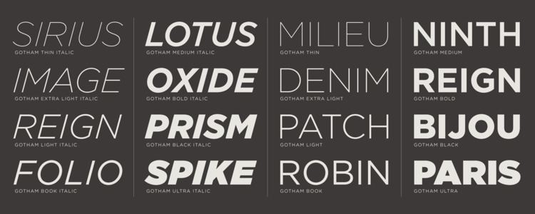
Gotham originally was introduced with an italic as well as a range of widths. In 2007, a Rounded variant was introduced due to a commission from Print magazine. In 2009, Hoefler and Frere-Jones introduced new Narrow and Extra Narrow versions. On April 4, 2011, Hoefler and Frere-Jones announced that they had created a new custom version of Gotham with serifs for the use of President Barack Obama's 2012 campaign. In announcing the news they wrote: "Can We Add Serifs to Gotham? For the President of The United States? Yes We Can. Following the closure of the 2012 US presidential elections, this serif version of Gotham has not yet been released publicly.