
Category Serif Date created 1992 | Classification DidoneDisplay Variations Big Figgins | |
 | ||
Designer(s) Matthew CarterEmployees of Vincent Figgins Foundry MicrosoftCarter & ConeFont Bureau | ||
Elephant is an ultra-bold serif typeface intended for display use, designed as a digital font by British font designer Matthew Carter. Elephant is a 'fat face' design, inspired by fonts intended for use for posters developed by Vincent Figgins in London in the early nineteenth century.
Contents
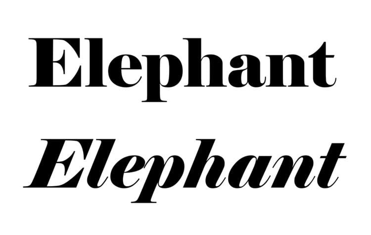
Carter created both a roman or regular style, and an italic; as an already bold design it does not have a bold style. Carter based Elephant on fonts in Figgins' 1815 and 1817 specimen books.
Releases
Elephant was published by Microsoft in 1992 for sale with some of its software, notably its TrueType Fontpack 2. It was later reissued in an expanded family under the name of 'Big Figgins' from 1998 onwards. This adds an 'inline' version (similar to Imprint Shadowed, but of course much bolder), in capitals only. It has been used as a titling font by the Washington Post, for which a derivative version suitable for smaller sizes was drawn. Some versions are credited to Carter's company, Carter & Cone, run with business partner Cherie Cone, and others also through Font Bureau. The original Microsoft release includes ligatures, but these are not automatically inserted. Big Figgins included minor changes such as a redesigned Euro sign.
History and background
Great changes took place in the style of printed letters available from type foundries in the hundred years after 1750. At the beginning of this period, fonts in British printing were predominantly intended for book and newspaper use. Modern bold fonts did not exist (although some titling capitals were quite bold); if a bolder effect was intended blackletter might be used.
A major development of the early nineteenth century was the arrival of the printed poster and increasing use of printing for publicity and advertising material, for example in newspaper adverts. This caused a desire to make eye-catching new types of letters available for printing. Presumably to be more striking, these new typefaces were often extremely bold. As a result, new styles of display type began to appear which were not just larger versions of body text-oriented serif fonts. Fat face typefaces were a part of this development, making verticals extremely, strikingly bold. Other new designs such as sans-serif ('Egyptian'), slab serif ('Antique'), and reverse-contrast ('Italian') typefaces were first created around the same time. (The names are those given by printers, which have little actual connection to history.)
The structure of Elephant is based on Didone fonts intended for body text such as those of Didot and Bodoni and their imitators; like them it has quite flat serifs with minimal bracketing, which become curls in italic. These have alternating thin and thick lines with relatively slender serifs. In fat faces like Elephant, the bolder lines are massively strengthened to create an overpoweringly bold effect, with a dramatic contrast between thick and thin strokes. While the style is sometimes described as 'Victorian', in fact fat faces were available on sale years before Queen Victoria was born in 1819.
Describing the Figgins typefaces and Carter's revival, Carter's friend historian James Mosley wrote:
To my mind Elephant is [an] elegant piece of draftsmanship. This may seem a curious remark, for...a "fat face" type [is] designed like a naval broadside to sock its commercial message by poster to the unconsenting reader at a distance of ten or twenty yards by sheer aggressive weight of heavy metal. The paradox of the design is that, while the thick lines were very thick, the thin ones remained the same [as in a normal weight font] - or in proportion, very thin indeed. Such exaggeration puts a huge strain on the designer if the result is to retain any coherence at all. Whoever cut the fat-faces of Vincent Figgins...handled the problems with what can only be described as elegance. Carter's homage to this unknown designer keeps most of the "ear-mark" features by which they can be distinguished from contemporary types of this kind.
Similar fonts
Many similar fonts were released from British typefounders in general in the nineteenth century by companies such as the Fann Street Foundry; they remained popular, partly as Victoriana. Similar post-nineteenth century fonts include: