Girish Mahajan (Editor)

Comparison of Adobe Flex charts

Updated on
Edit
Like
Comment
Share on FacebookTweet on TwitterShare on LinkedInShare on Reddit
Comparison of Adobe Flex charts

The following comparison of Adobe Flex charts provides charts classification, compares Flex chart products for different chart type availability and for different visual features like 3D versions of charts.
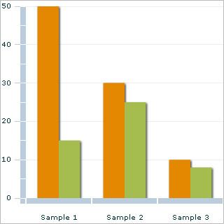
This gallery shows:

  • Bar/Column chart - uses bars/columns to show frequencies or values for different categories.
  • Line chart - two-dimensional Scatterplot of ordered observations where the observations are connected following their order.
  • Pie chart - shows percentage values as a slice of a pie.
  • Area chart - line chart which displays graphically quantitive data. The area between axis and line are commonly emphasized with colors, textures and hatchings.
  • Scatter plot - type of mathematical diagram using Cartesian coordinates to display values as collection of points for two variables for a set of data.
  • Circular charts - Radar chart (Spider chart) or Polar chart is a two-dimensional chart of three or more quantitative variables represented on axes starting from the same point.
  • Accumulation charts - Pyramid (Cone) or Funnel chart displays data that, when combined, equals 100%.
  • Tree/Heat map - chart where the areas of the rectangles correspond to values. Other dimensions can be represented with colour or hue.
  • Finance chart - stock market prices are often depicted with an open-high-low-close chart with a traditional bar chart of volume at the bottom.
  • Cartogram chart is a map in which some thematic mapping variable – such as population, economic etc. – is substituted for land area.
  • Gantt chart - helps in scheduling complex projects.
  • Dependency graph is a directed graph representing dependencies of several objects towards each other.
  • Nomogram - a two-dimensional diagram designed to allow the approximate graphical computation of a function: it uses a coordinate system other than Cartesian coordinates.
  • Organizational chart is a diagram that shows the structure of an organization and the relationships and relative ranks of its parts and positions/jobs.
  • Flow chart - a diagram, that represents an algorithm or process, showing the steps as boxes of various kinds, and their order by connecting these with arrows.
  • References

    Comparison of Adobe Flex charts Wikipedia


    Similar Topics