
 | ||
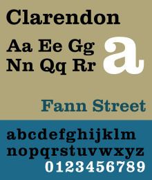
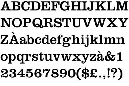
Clarendon is a slab-serif typeface that was created by Robert Besley for Thorowgood and Co. (or Thorowgood and Besley) of London, a letter foundry often known as the Fann Street Foundry. It was apparently named after the Clarendon Press in Oxford.
Contents
The typeface was published in 1845 after Besley, an employee of the foundry since 1826, was made a partner in the firm. Due to its popularity, Besley registered the typeface under Britain's Ornamental Designs Act of 1842. The patent expired three years later, and other foundries were quick to copy it. Besley was nonetheless successful in business, and became the Lord Mayor of London in 1869. Clarendon is considered the first registered typeface.
Clarendon types proved extremely popular in many parts of the world, in particular for display applications such as posters printed with wood type. They are therefore commonly associated with wanted posters of the American Old West.
Revivals
The original Clarendon became the property of Stephenson Blake in 1906, who marketed a release named Consort, cutting some additional weights (a bold and italics) in the 1950s. The original matrices and punches were transferred to the Type Museum collection when Stephenson Blake left the printing business in 1996.
Designs for wood type were made from the mid-1840s on. The typeface was reworked by Monotype in 1935. Hermann Eidenbenz and Edouard Hoffmann cut a version, based on Besley's original design, in 1953. Freeman Craw drew the Craw Clarendon family, a once popular American version, released by American Type Founders, in 1955, with light, bold and condensed variants.
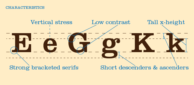
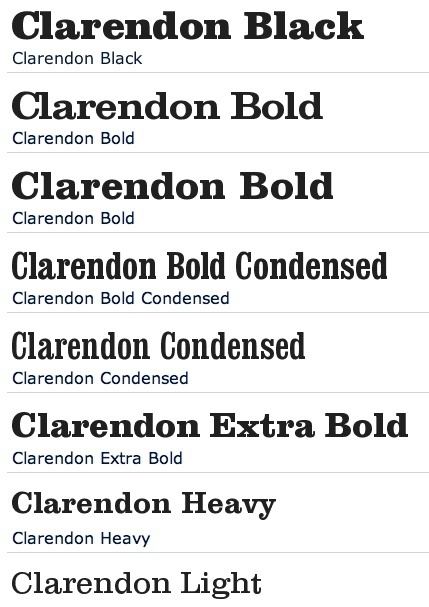
A variety of Clarendon revivals have been made since the original design, often adapting the design to different widths and weights. The original Clarendon design did not feature an italic, and many early Clarendon designs, being intended for headings, have capitals only with no lower-case letters, leaving many options for individual adaptation. An italic is particularly important in any design intended to be used for body type, and so designs have variously attempted to create an italic or offered obliques instead, a less conventional option for serif typefaces in which the characters are simply slanted. Volta, sold as Fortune in the U.S., was a very modern view of Clarendon, designed by Konrad Friedrich Bauer and Walter Baum for the Bauer Type Foundry, also in 1955. It is also the first to feature an italic in the medium weight.
Aldo Novarese drew the Egizio family for Nebiolo, in Turin, Italy in 1958. The design included matching italics. David Berlow, of the Font Bureau, expanded that same family and released it as Belizio in 1998.
Ray Larabie, of Typodermic, released the Superclarendon family in 2007, using obliques instead of italics. A wide, display-oriented design with small caps and Greek and Cyrillic support, it is bundled with OS X.
The Clarendon Text family with italics inspired by Egizio, was released by Patrick Griffin of Canada Type, that same year. Sentinel, from Hoefler & Frere-Jones, another typeface family based on Clarendon with italics added, was designed in 2009. Intended to have less eccentric italics suitable for body text use, it has been featured heavily in President Barack Obama's 2012 campaign website advertisements. Canada Type's Patrick Griffin came back to expand his Clarendon family with Clarendon Wide in 2010.
French Clarendon
In the late nineteenth century the basic Clarendon face was radically altered by foundries in the United States, resulting in the production of the 'French Clarendon' type style, which had enlarged block serifs at top and bottom. This style is also traditionally associated with wild-west printing; it is commonly seen on circus posters and wanted notices in western movies. However, it was actually used in many parts of the world at the time.
The concept, now called as reverse-contrast or reverse-stress type, predated Clarendon altogether. It began, possibly around 1821 in Britain, as a parody of the elegant Didone types of the period. It was created by inverting the contrast of these designs, making the thin strokes thick and the thick strokes thin. The result was a slab serif design because of the serifs becoming thick. (In the 19th century, these designs were called Italian because of their exotic appearance, but this name is problematic since the designs have no clear connection with Italy; they do slightly resemble capitalis rustica Roman writing, but this may be a coincidence. For similar reasons they were also called Egyptian or Reversed Egyptian, Egyptian being an equally arbitrary name for slab serifs of the period.)
Intended as attention-grabbing novelty display designs rather than as serious choices for body text, within four years of their introduction the printer Thomas Curson Hansard had described them as 'typographic monstrosities'. Derivatives of this style persisted, and the concept of very thick serifs ultimately merged with the Clarendon genre of type. The advantage of French-Clarendon type was that it allowed very large, eye-catching serifs while the letters remained narrow, suiting the desire of poster-makers for condensed but very bold type. Fine printers were less impressed by it: DeVinne commented in 1902 that "To be hated, it needs but to be seen."
Because of their quirky, unusual design, lighter and hand-drawn versions of the style were popular for uses such as film posters in the 1950s and 60s. A variety of adaptations have been made of the style, Robert Harling's Playbill and more recently Adrian Frutiger's Westside, URW++'s Zirkus and Bitstream's P. T. Barnum.
A radically different approach has been that of Trilby by David Jonathan Ross, who has written on the history of the genre. Released by Font Bureau, it is a modernisation reminiscent of Clarendon revivals from the 1950s. It attempts to adapt the style to use in a much wider range of settings, going so far as to be usable for body text. Bigfish is another modernisation inspired by lettering, in which the thickest stress is at the top. Some other adaptations have preserved the concept but changed genre, presenting sans-serif or script typefaces in the same style. Antique Olive of 1966 by Roger Excoffon can be seen as an early sans-serif example of this.
Appearances
Craw Clarendon Bold was used by the United States National Park Service on traffic signs, but has been replaced by NPS Rawlinson Roadway. In 2008, the typeface was utilized extensively by the Ruby Tuesday restaurant chain in the re-launch of their corporate identity. Via, the travel magazine of the American Automobile Association, uses the typeface for its logo and headline copy.
A heavy bold Clarendon was used for the cast brass locomotive nameplates of the Great Western Railway. This was however drawn within the Swindon drawing office, not by a type foundry, and this 'Swindon Egyptian' differed in some aspects, most obviously the numerals used for the cabside numberplates.
Versions of Clarendon can also be seen in the logotypes of corporations such as Sony, Pitchfork Media, Wells Fargo, the Spanish newspaper El País and the Swedish house manufacturer Älvsbyhus. The American game show Wheel of Fortune uses a modified version of Konrad Bauer and Walter Baum's Fortune, a typeface based on the forms of Clarendon, on its eponymous Wheel. The American rock band Switchfoot also utilizes a slightly distressed and altered version of the font for the band name on all of their albums and publications since the release of The Beautiful Letdown in 2003.
On television, Craw Clarendon Bold was used in the early seasons of The Electric Company on PBS, and Witt/Thomas/Harris Productions shows, like Benson (TV series). Craw Clarendon Bold Condensed was used for the titles on NBC's Little House on the Prairie (TV series), which aired from 1974 to 1983.
Signs in neighborhoods within Vancouver city limits once used Clarendon on white on blue signs.
The album cover of U2 album How to Dismantle an Atomic Bomb in 2004 also featured this font.
Castleton University uses Clarendon for headlines on its website.
This font can be also seen on all of trams and buses of Public Transport Company in Poznań Ltd. located in the city of Poznań, Poland.