
Classification Modulated | ||
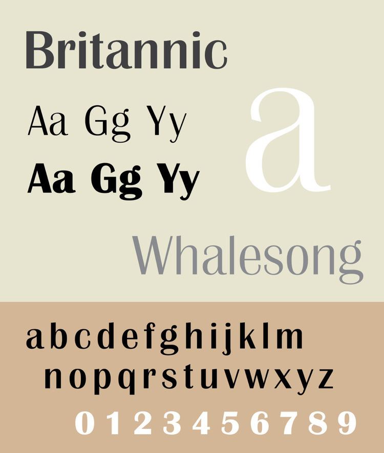 | ||
Britannic is a sans-serif typeface family that was sold in metal type by Stephenson Blake. It is a "modulated" or stressed sans-serif design, in which the vertical lines are clearly thicker than the horizontals. The Klingspor Museum reports that it was originally created by the Wagner & Schmidt foundry of Leipzig, Germany. In design it is intended for headings, advertisements and signs rather than continuous body text. Stephenson Blake advertised it as "just the right note for an advertising or display panel".
Since Stephenson Blake did not continue operations into digital fonts, a variety of digitisations of different weights and widths of Britannic have been released by different companies. Some releases include an all-capitals condensed weight. The bold weight, digitised by URW, is included with some Microsoft software such as Office. A wry commentary on the design, presumably by Microsoft's typography manager Robert Norton, adds:
This interesting face always excites heated opinions. Some, like the writer, have always put Britannic Bold firmly in the category called 'Monumentally Overrated'. Others swear by it. In fact, a survey conducted at great expense (among three people) found that two out of three thought Britannic Bold was magnificent. And it can't be all bad, having started life at the renowned Stephenson Blake type foundry, and to have outlasted the same foundry's Rothbury, which to most people is probably indistinguishable...